The 10 principles of the Thumbnail: How to drive more clicks
One thing that many content creators sleep on is the power of the thumbnail. the success of your content often depends less on what happens in the video but more on what happens in the split second before it starts. So, if you’re looking to drive more clicks with your content then read on.
Thumbnails and the 1.8-second rule
Research into viewer behaviour reveals an interesting and rather brutal truth. The average user takes just 1.8 seconds to decide whether to click your video or keep scrolling. In this micro-window, the brain isn’t “reading”, it’s scanning for emotional triggers, visual clarity, and relevance. If your thumbnail is cluttered, confusing, or low-quality, the brain rejects it as low-value before the viewer even consciously processes your title. Think of your thumbnail not as a summary of your video, but as a high-speed billboard designed to spark a “Curiosity Gap” that can only be satisfied by a click.
Formatting for success
Unfortunately you cannot use a “one size fits all” approach if you want to maximise your thumbnails potential and subsequent reach. While the psychology remains consistent, the technical execution varies across the major platforms.
YouTube (The Classic Billboard):

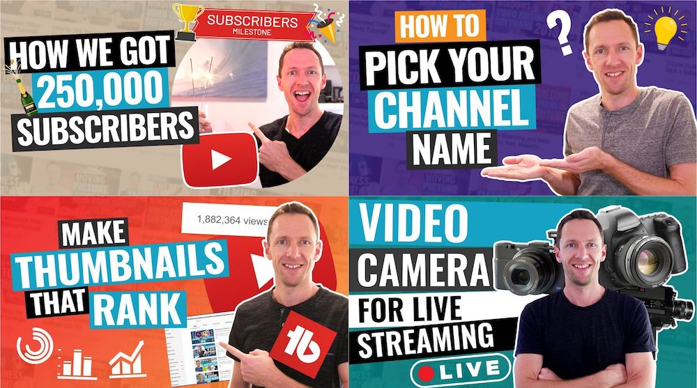
YouTube remains the king of custom thumbnails. The standard is a 16:9 aspect ratio. Here, the thumbnail works in tandem with the title to provide a narrative hook. Because YouTube is often discovery-driven, your thumbnail must look professional and high-contrast to stand out against the platform UI
TikTok & Instagram:

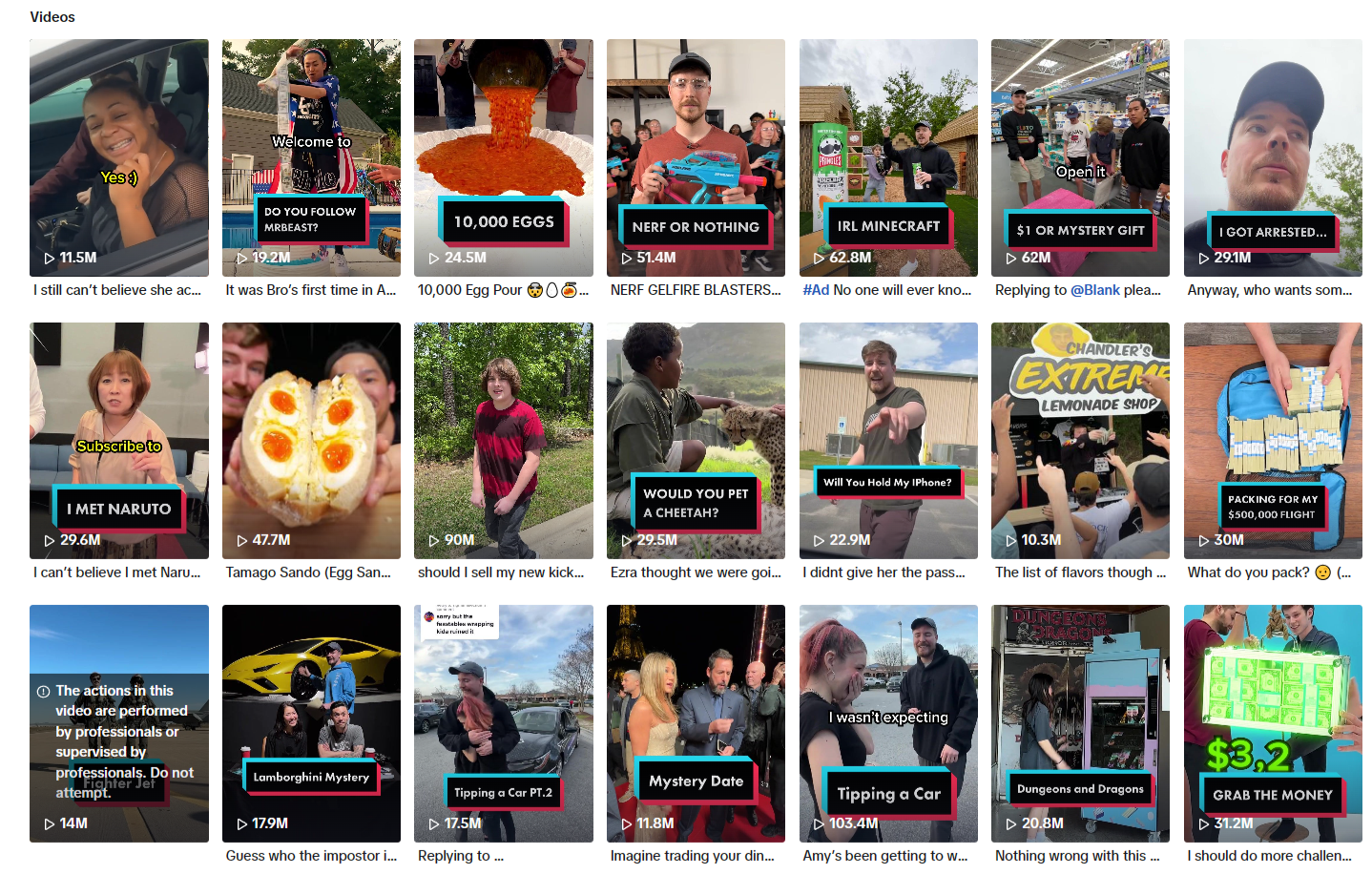
these platforms, the “thumbnail” is known as the Cover and uses a 9:16 vertical ratio. While the feeds often autoplay, the cover is critical for your profile grid and search results. It’s your storefront; it tells a potential follower what your brand “vibe” is. On Instagram specifically, you must ensure the central 1:1 square of your cover looks good, as that is how it appears on your main grid.
Facebook:
Facebook is a hybrid, supporting various ratios, but 1:1 (Square) or 4:5 (Vertical) often perform best. Unlike YouTube, Facebook users are often passive scrollers. Your thumbnail here needs to be even more disruptive, using bold text or striking imagery to stop someone who wasn’t even looking for a video in the first place.
10 Elements that drive the click
To win the 1.8-second battle, you need to master the psychology of visual storytelling. Here are ten essential elements to help inspire your thumbnail game:
1. Extreme emotion

Human beings are programmed to mirror the emotions we see in others. By featuring a face with an exaggerated (but genuine) expression like shock, fear, or pure elation, you trigger a “mirror neuron” response that makes the viewer want to find out what caused that reaction.
2. The rule of three

Cognitive load is the enemy of the click; if a thumbnail is too busy, the brain skips it to save energy. Limit your composition to three main visual points (usually a face, a key object, and a short text hook) to ensure the viewer can process the entire “story” instantly.
3. The “BOGY” colour palette

Platforms like YouTube and Facebook use red, white, and dark grey in their interface, meaning those colours often blend in. Using Blue, Orange, Green, and Yellow (BOGY) creates a natural contrast that draws the eye toward your content and away from the platform’s own menus.
4. Subject isolation

In a crowded feed, depth is your best friend. By adding a soft blur to the background or a subtle white “sticker” outline around your main subject, you create a 3D effect that makes the “hero” of your thumbnail jump off the screen and grab attention.
5. The 4-word max

Most viewers are browsing on small mobile device screens, where long sentences become unreadable. Use a maximum of four words in a bold, sans-serif font to amplify the title rather than repeat it, ensuring your message is legible even at a glance.
6. Directional cues

While they can feel like a cliché, bright red or yellow arrows and circles are incredibly effective at focusing the viewer’s attention on a specific detail. They act as “visual breadcrumbs” that tell the brain exactly where the most interesting part of the image is hidden.
7. Visual “before & after”

Humans are naturally drawn to transformation and resolution. By splitting your thumbnail to show a “problem” on the left and a “solution” on the right, you tap into the viewer’s desire to understand the process or learn the secret behind the improvement.
8. Direct eye contact

Eye contact creates an immediate psychological bridge between the creator and the viewer, building a sense of trust and intimacy. When a subject in a thumbnail looks directly into the “lens,” it acts as a silent invitation for the viewer to join the conversation.
9. Filling curiosity gaps

One of the most powerful click-drivers is a question that hasn’t been answered yet. By showing a strange object, a censored detail, or a “mystery box,” you create an information gap that the viewer’s brain feels a physical need to close by clicking the video.
10. Brand Consistency

Over time, your thumbnails should become a “visual signature.” for your channel/brand. Using a consistent font style, colour pallet, or layout ensures that loyal followers can identify your content instantly in a sea of competitors, significantly increasing your repeat-viewer click-through rate (CTR).
Putting the theory into action
Understanding these elements is vital if you are going to embrace a thumbnail stratagy. Skilful and thoughtful implementation is the key to your growth and success. To put this into action, start by considering and even designing your thumbnail before you even hit record. Remember, you probably won’t be able to incorporate all 10 of these elements into a single thumbnail. Instead, figure out which elements are likely to work best with your audience. You should treat the thumbnail as part of pre-production. This way you can steer the narative of the video as well as ensuring you capture the necessary “reaction shots” or “hero images” during filming rather than spending time hunting for a low-quality screenshot later.
Secondly, embrace A/B Testing. Most platforms now allow you to upload two different thumbnail versions to see which performs better. Don’t guess what your audience likes. Instead let the data tell you. Use your newfound “Thumbnail Psychology” to create one “Safe” version and one “Experimental” version. Over time, you’ll develop a signature style that earns the click every time.
Stop risking your channel’s revenue and momentum on a flawed system.
RouteNote Licensing guarantees that the music you license is protected from Content ID claims, allowing you to focus on what you do best: creating great content.
Click Here to Start Your Claim-Safe Journey Today!
